The old RSC Logo
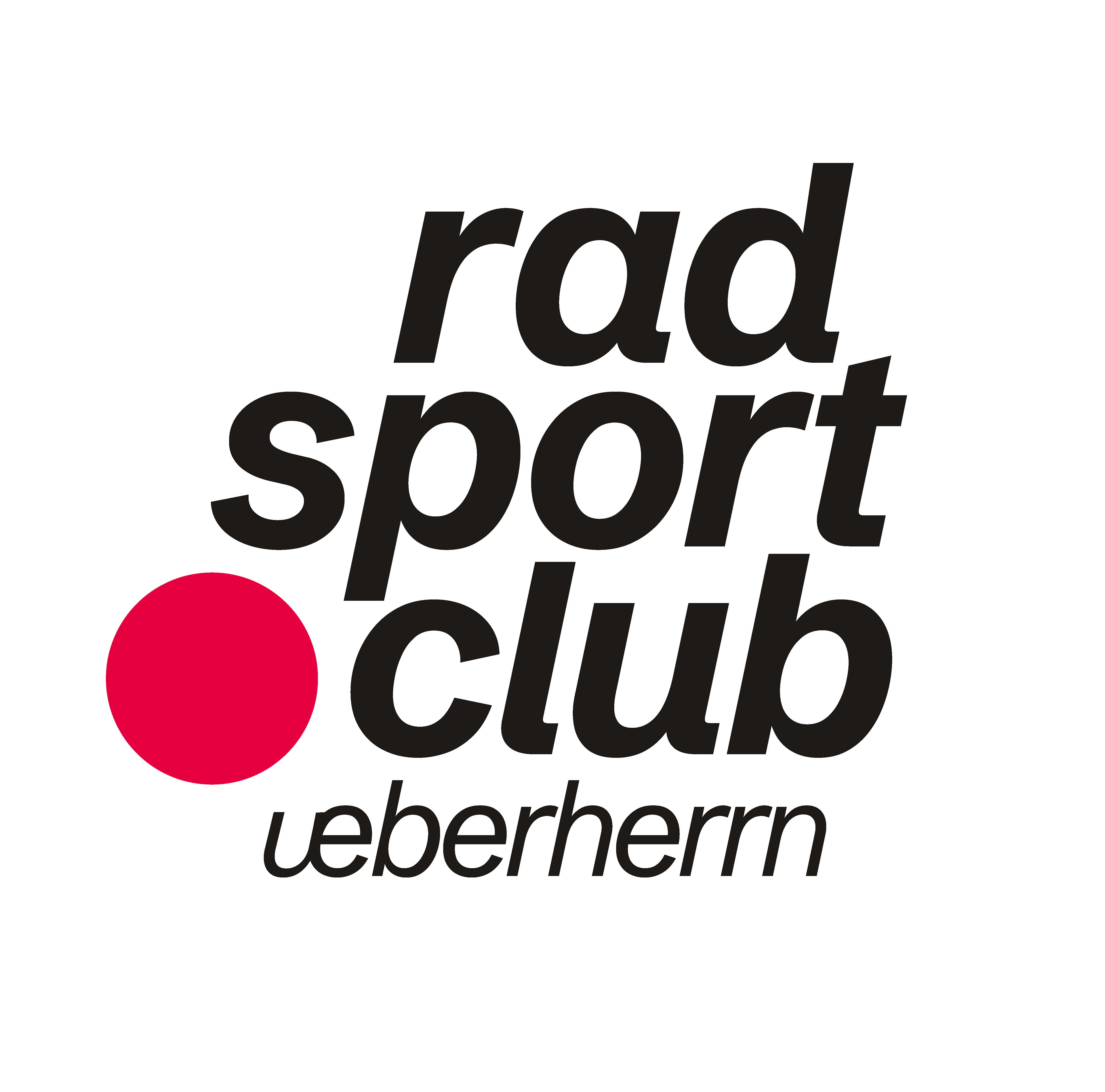
The new primary RSC Logo
The new secondary Logo
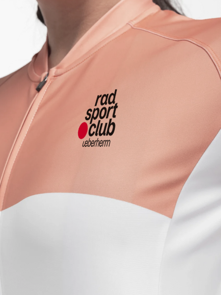
The task was to refine the existing logo while staying close to the original, since members were already familiar with its look and colors. To give the club a more distinctive identity, I replaced the umlaut »ü« with a ligature, creating a stronger connection to their frequently used short form, RSCUE. The circle surrounding the logo was removed for a more dynamic and open feel, while still referenced as a symbol of community. The italic typography conveys movement, and the refreshed color palette feels more approachable while keeping the spirit of the club.
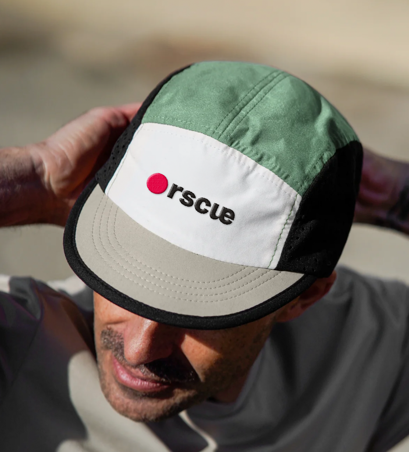
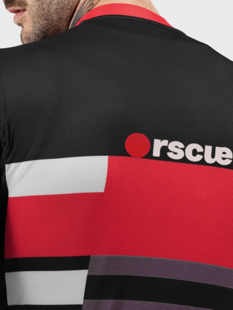
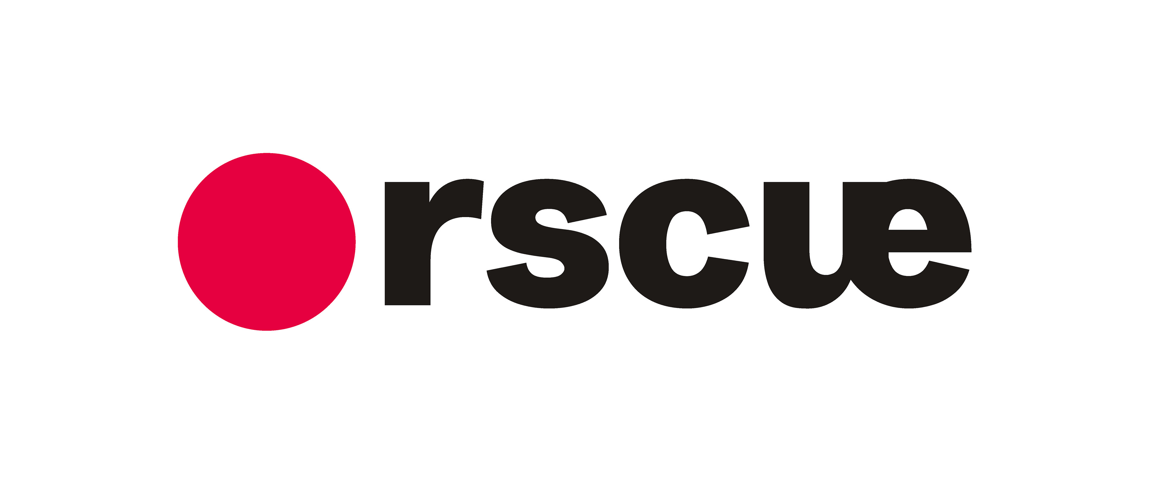
To strengthen the RSCUE short form, I also designed a secondary logo. The lettering combined with a red circle references the REC symbol on sports cameras, adding an energetic, action-oriented dimension to the brand.