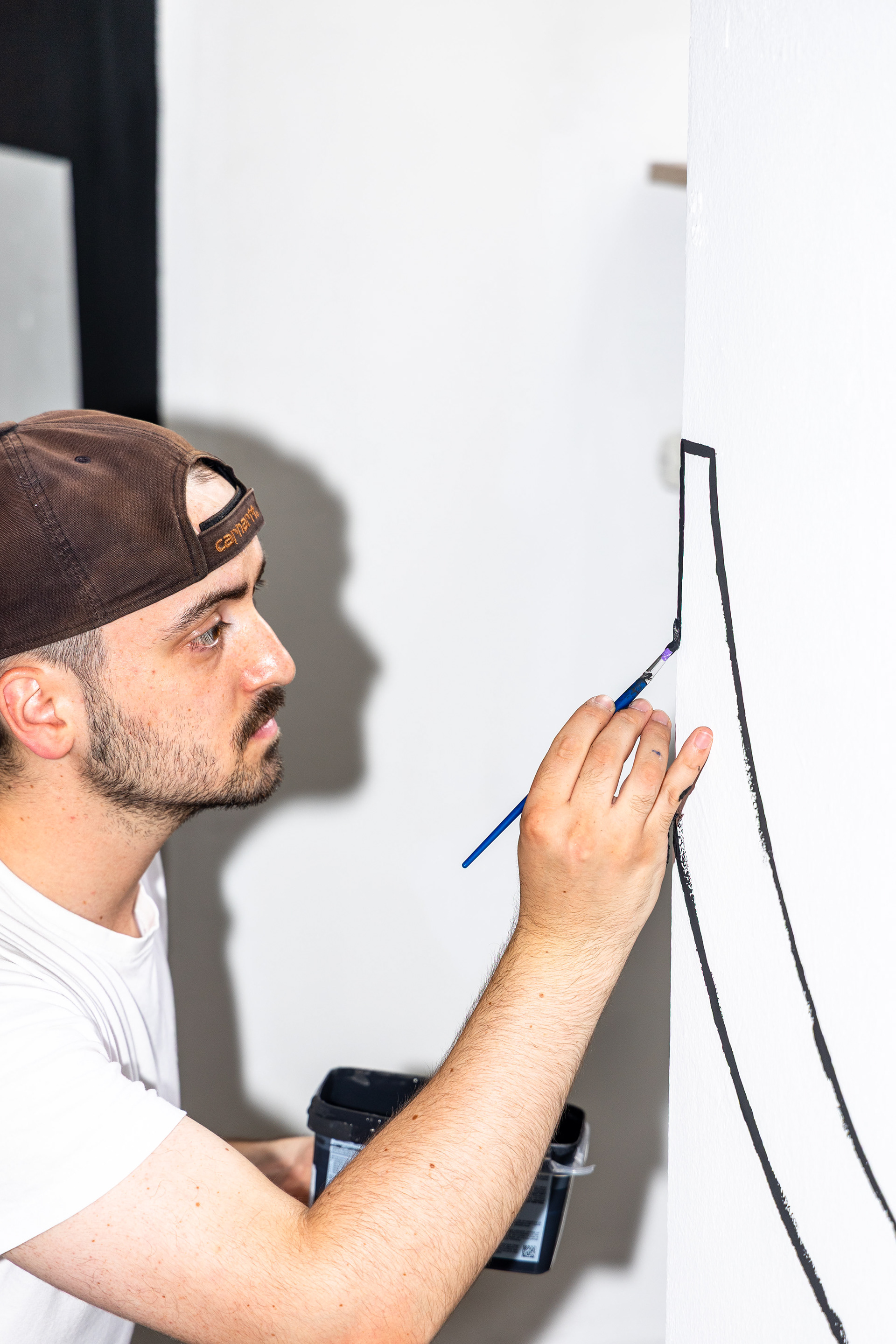
You might be familiar with the problem: standing in front of a coffee shelf, searching for a specific roast, but everything somehow looks the same. This observation became the starting point for my master’s thesis. My goal was to create a typeface that makes the contents instantly recognizable at first glance – a typography that visually communicates the taste of the coffee.
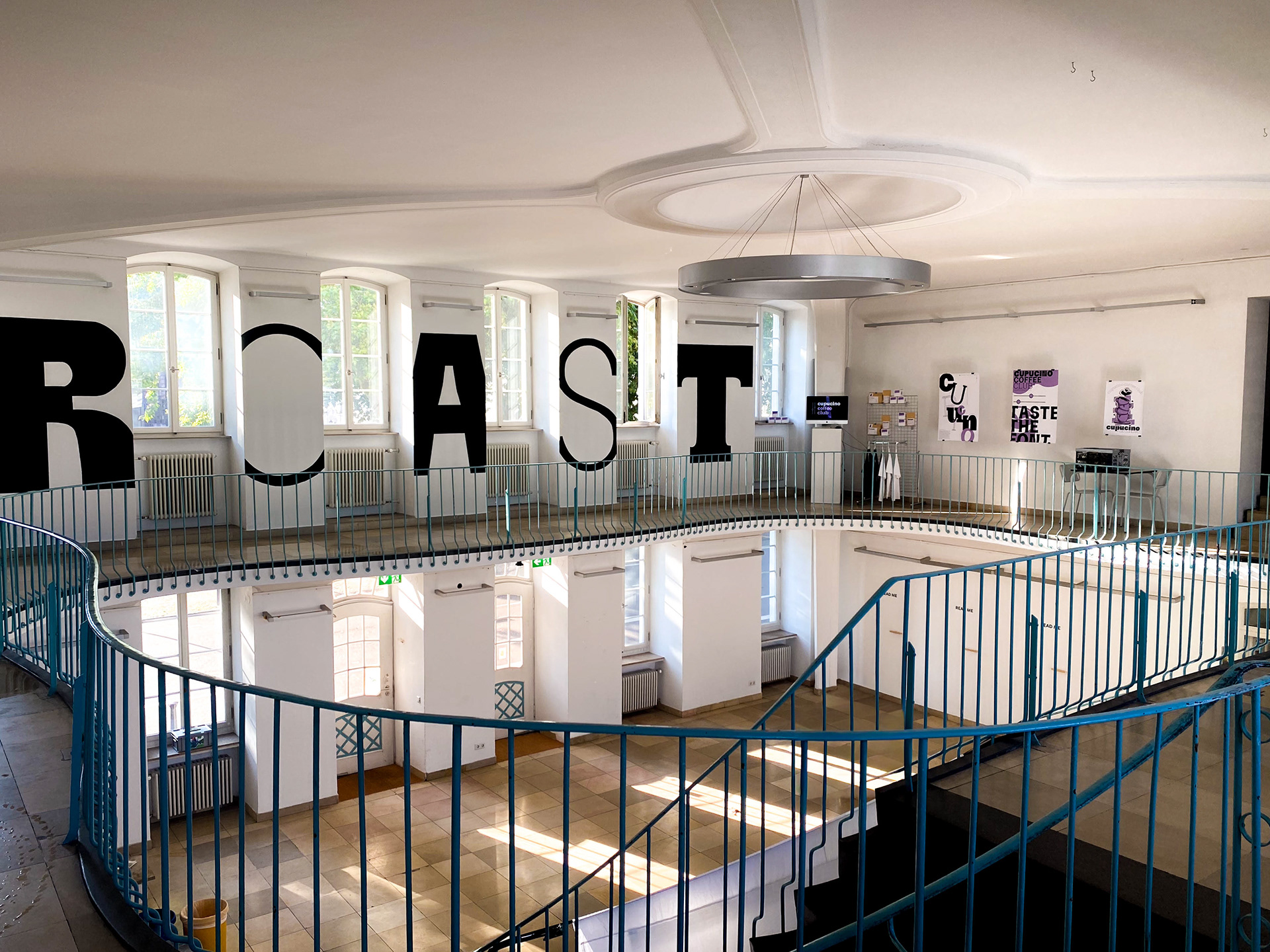
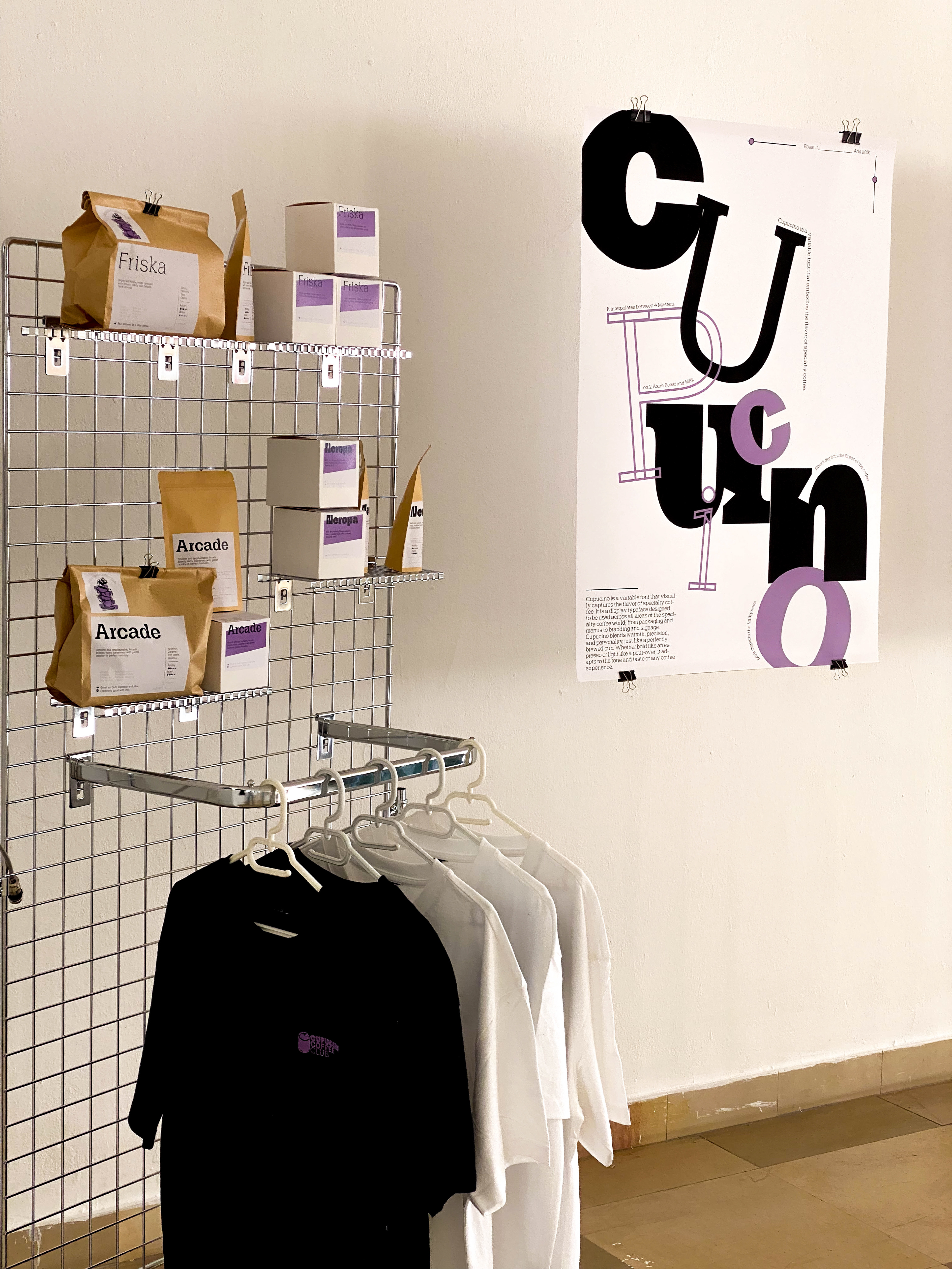
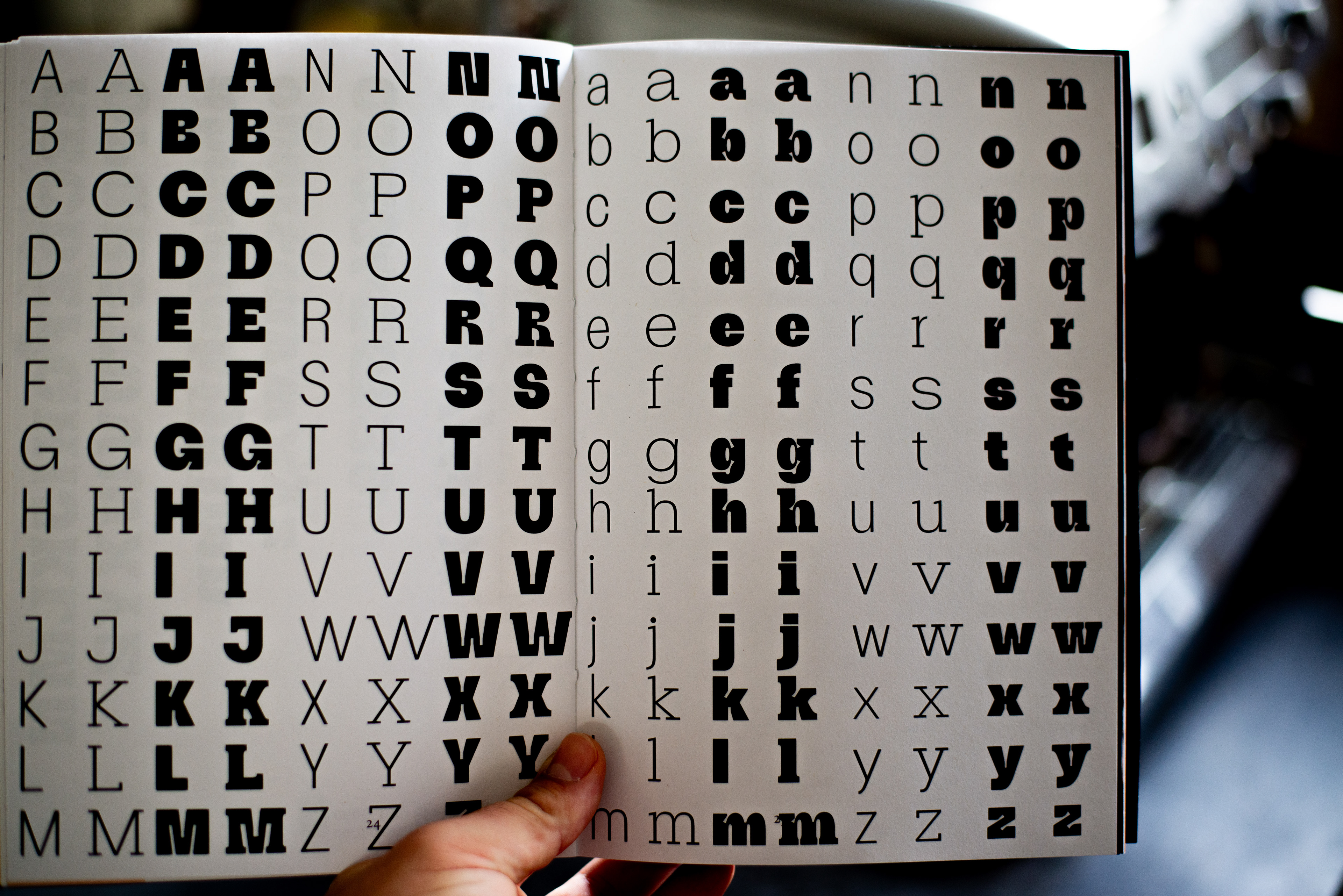
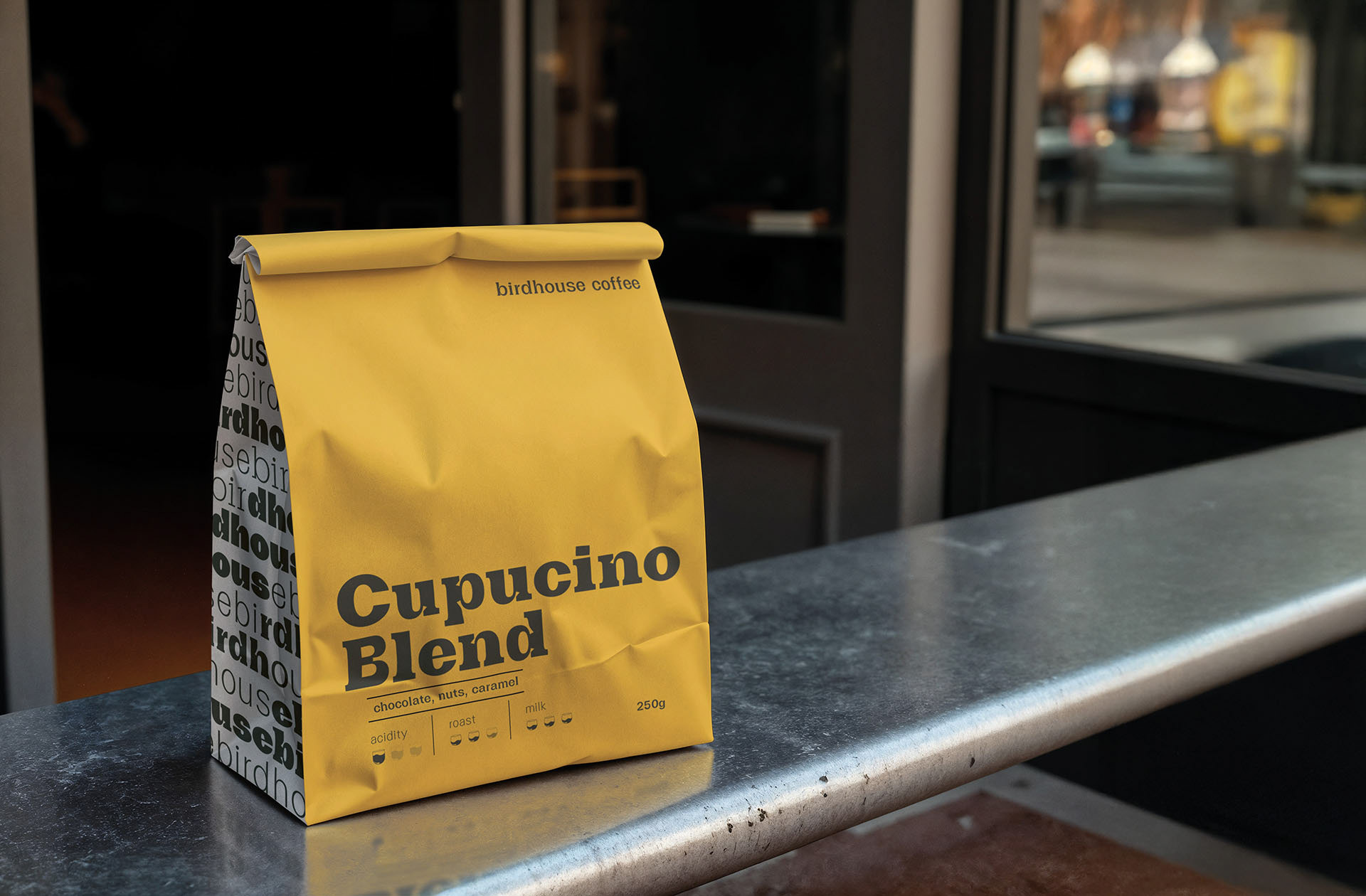
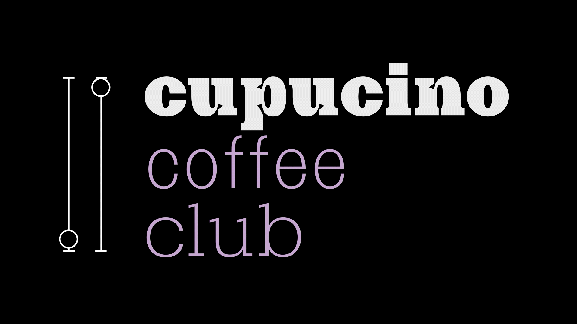
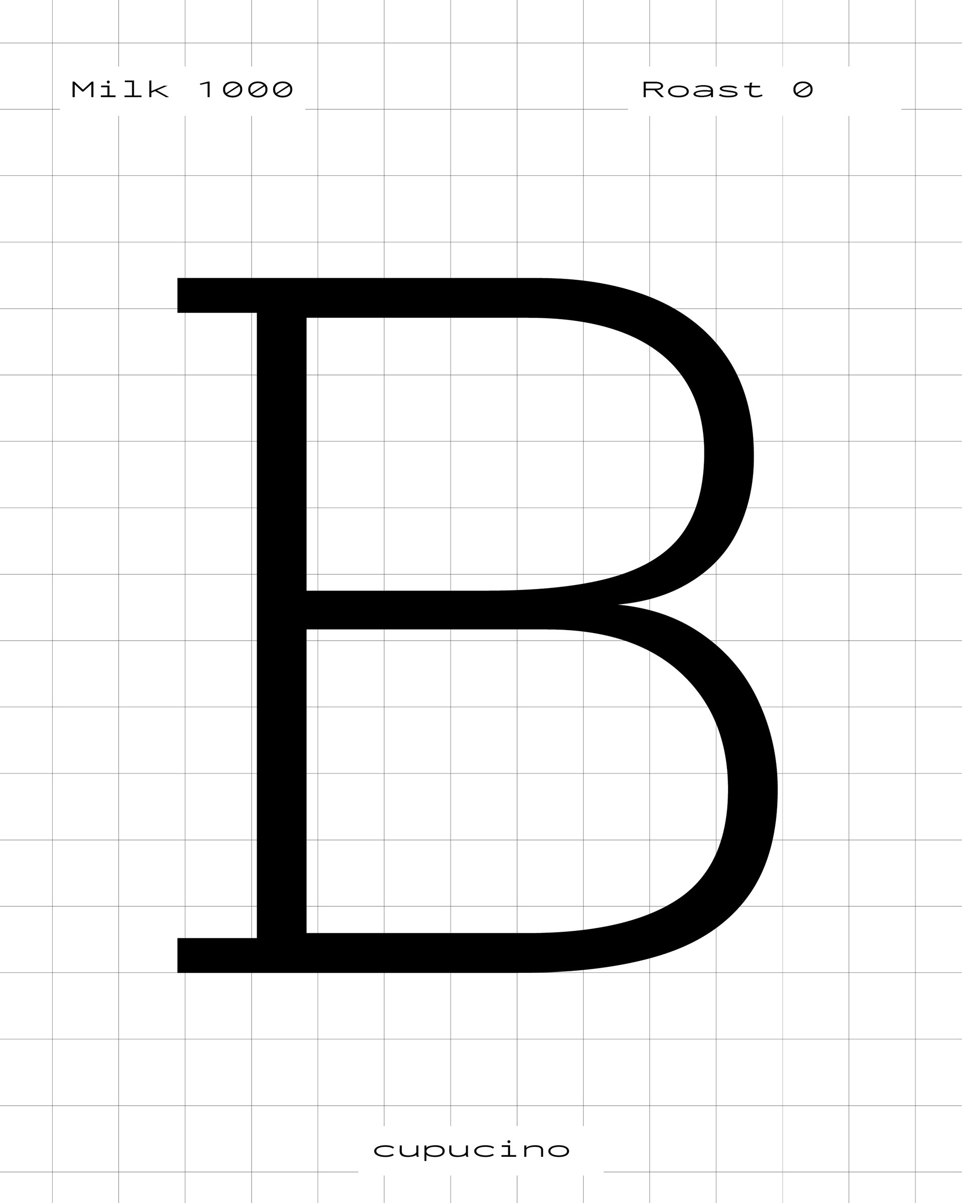
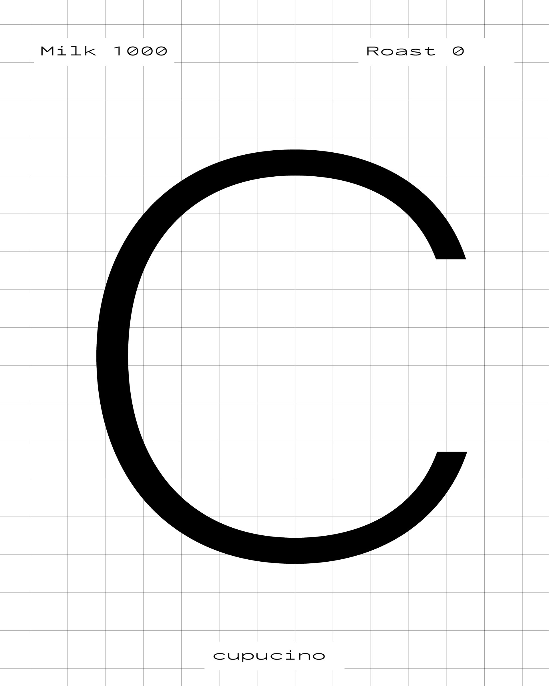
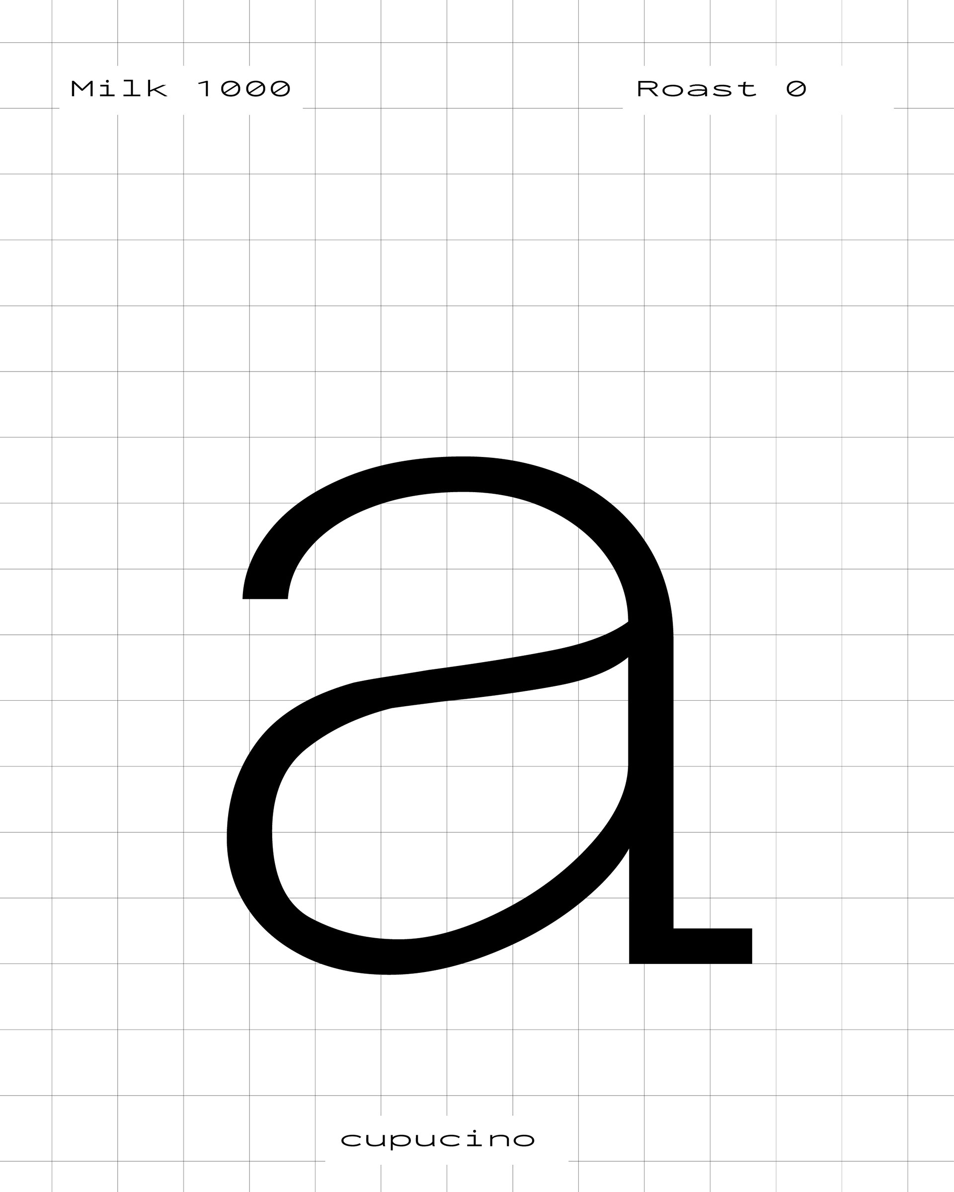
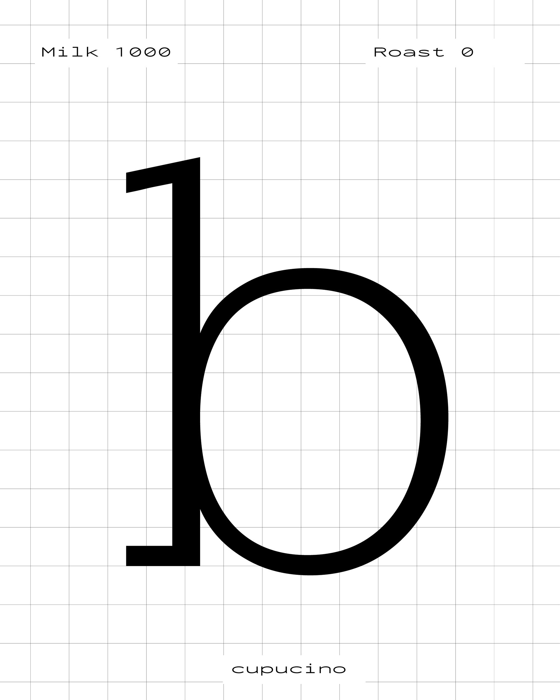
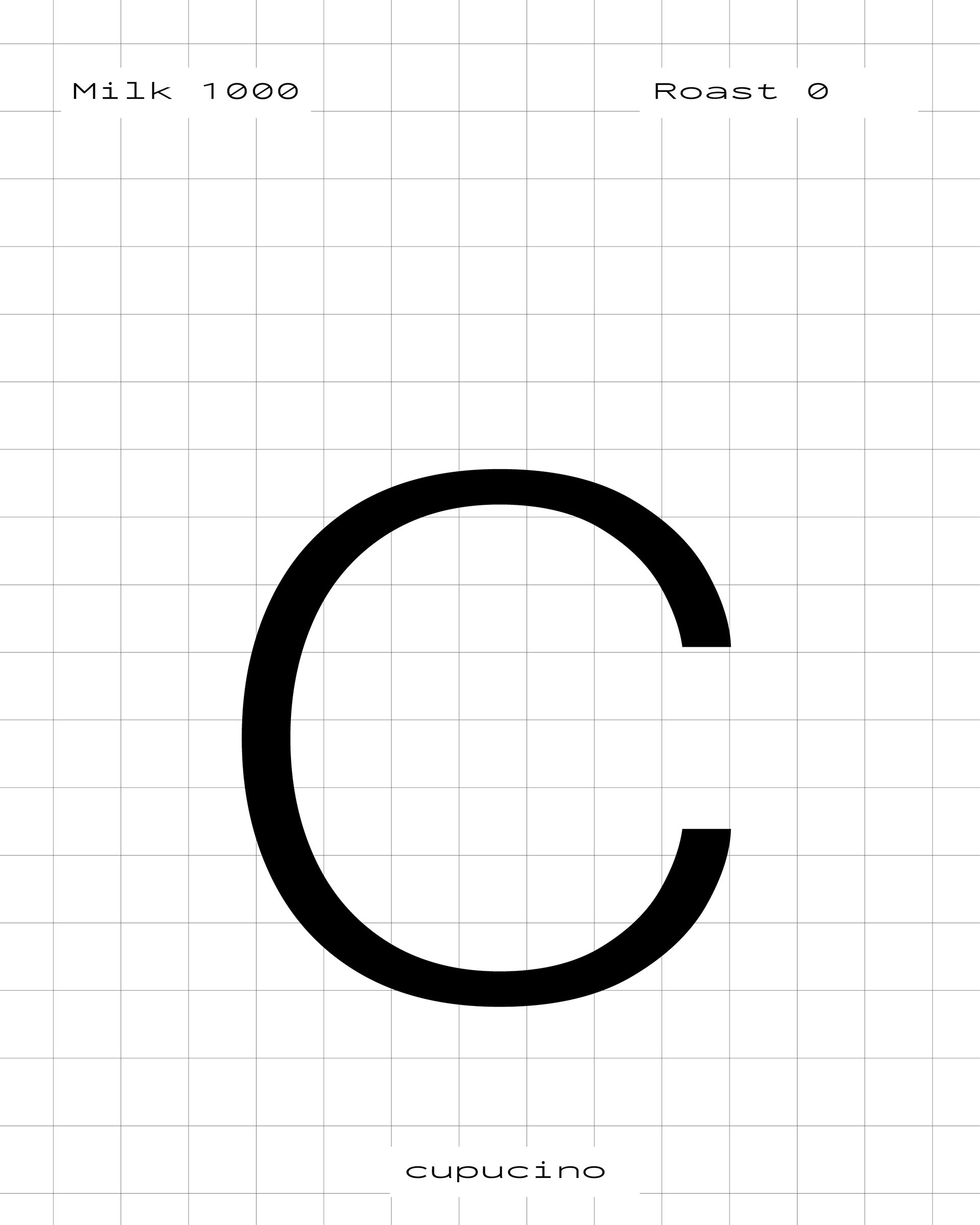
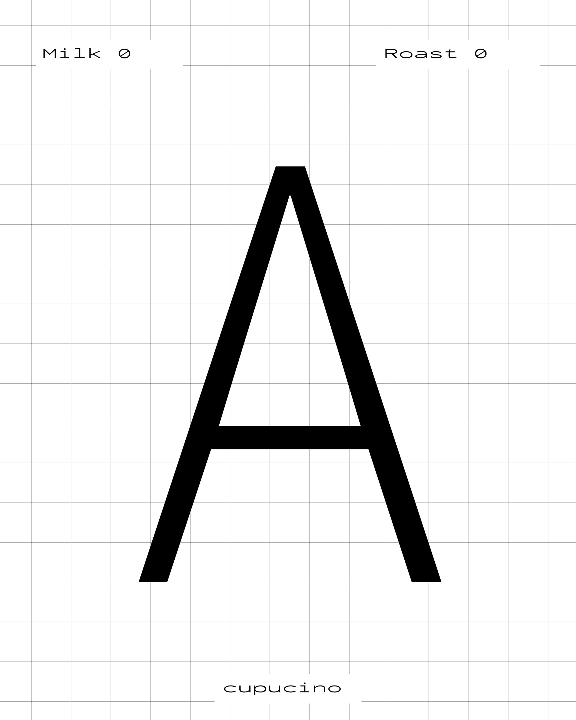
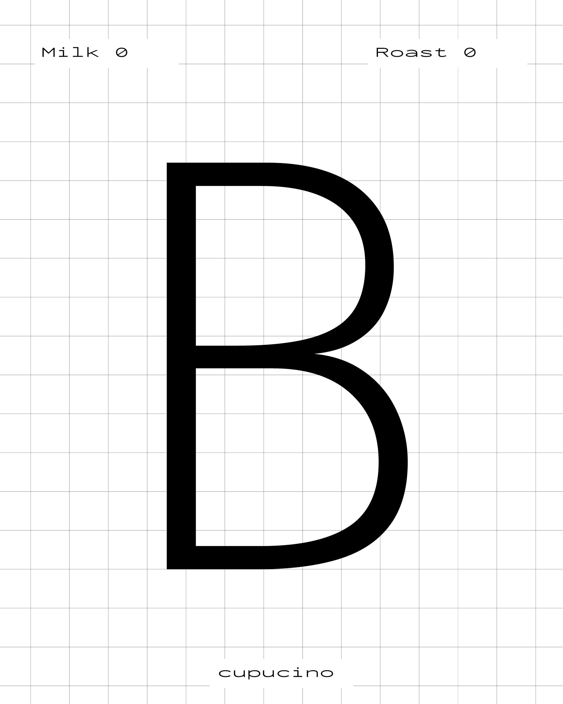
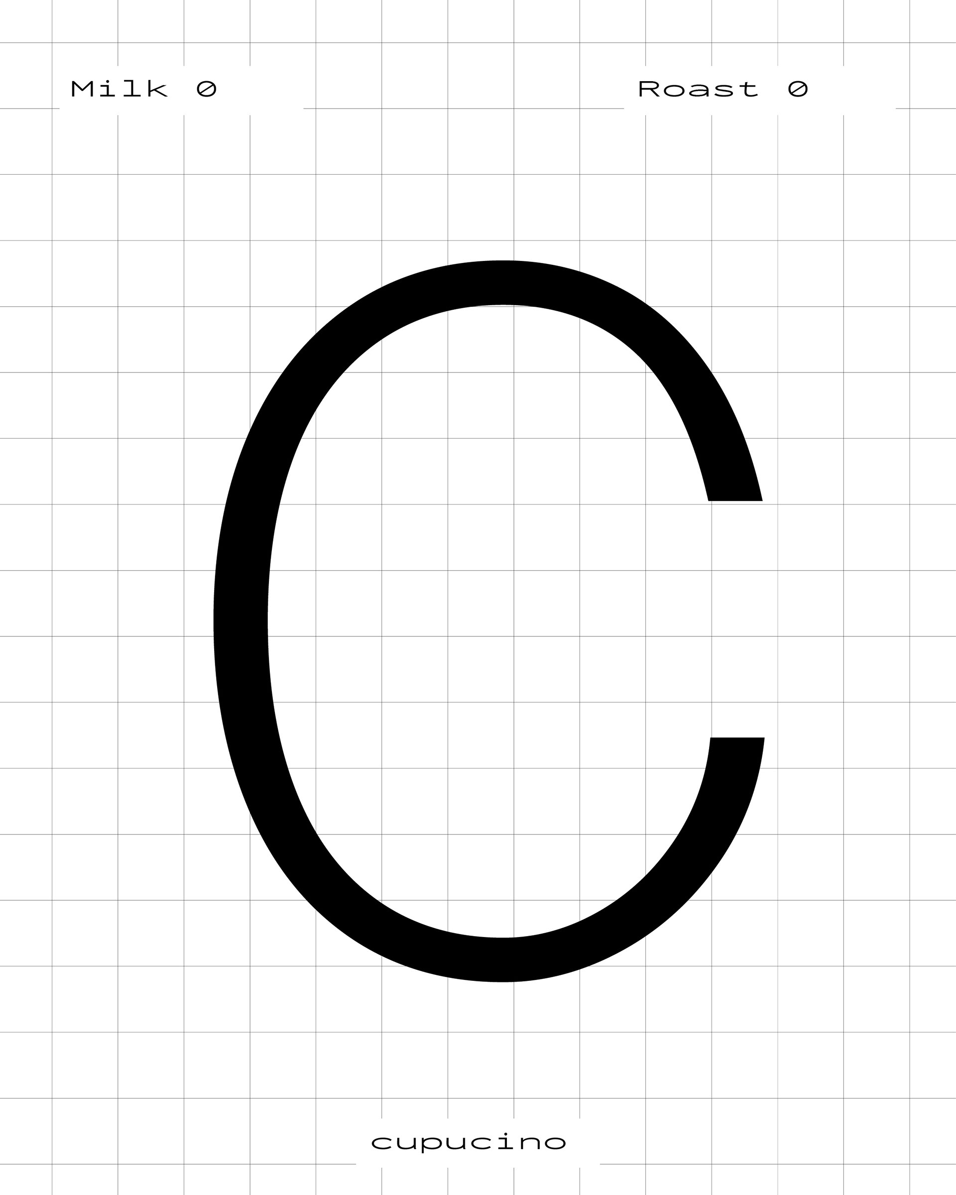
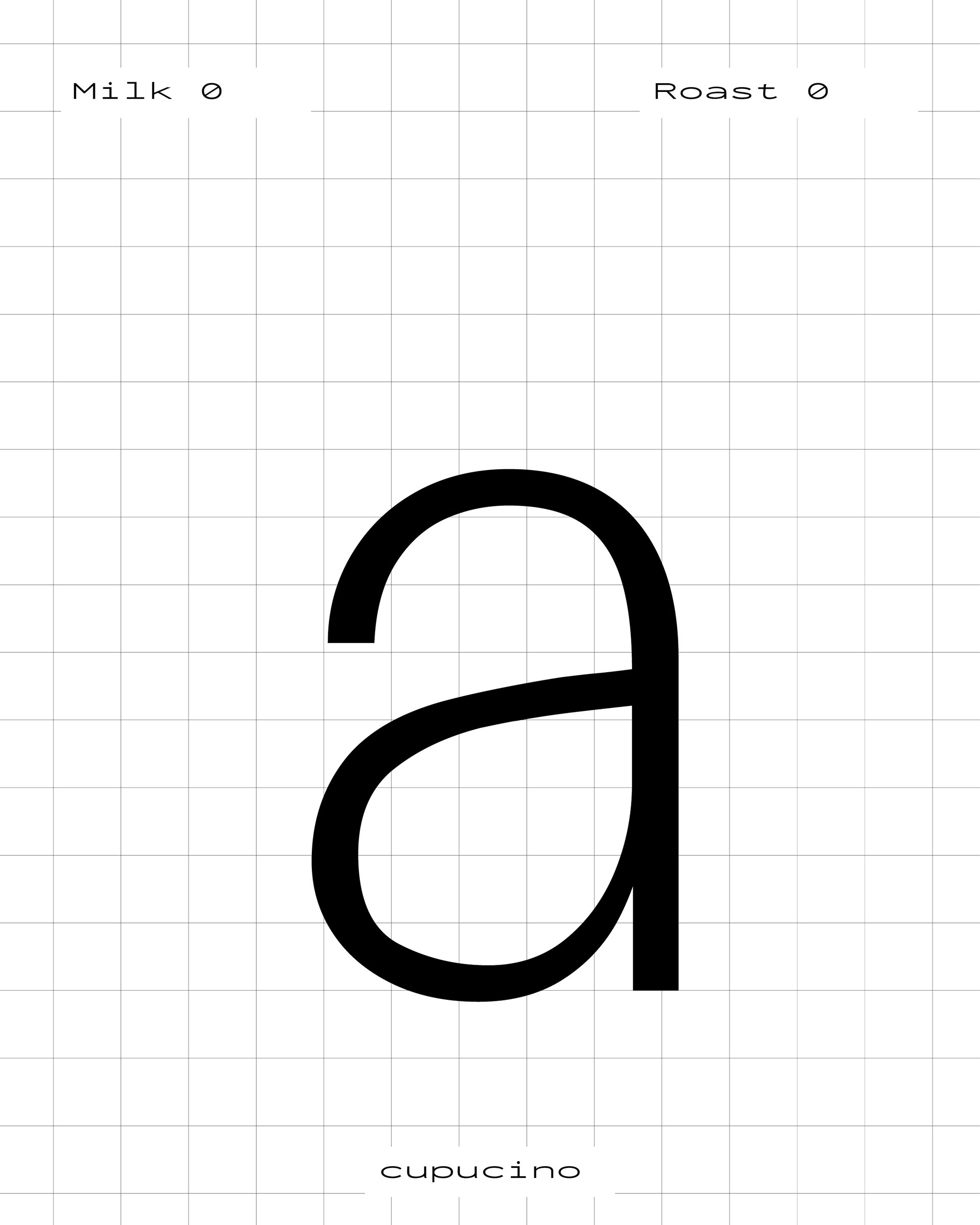
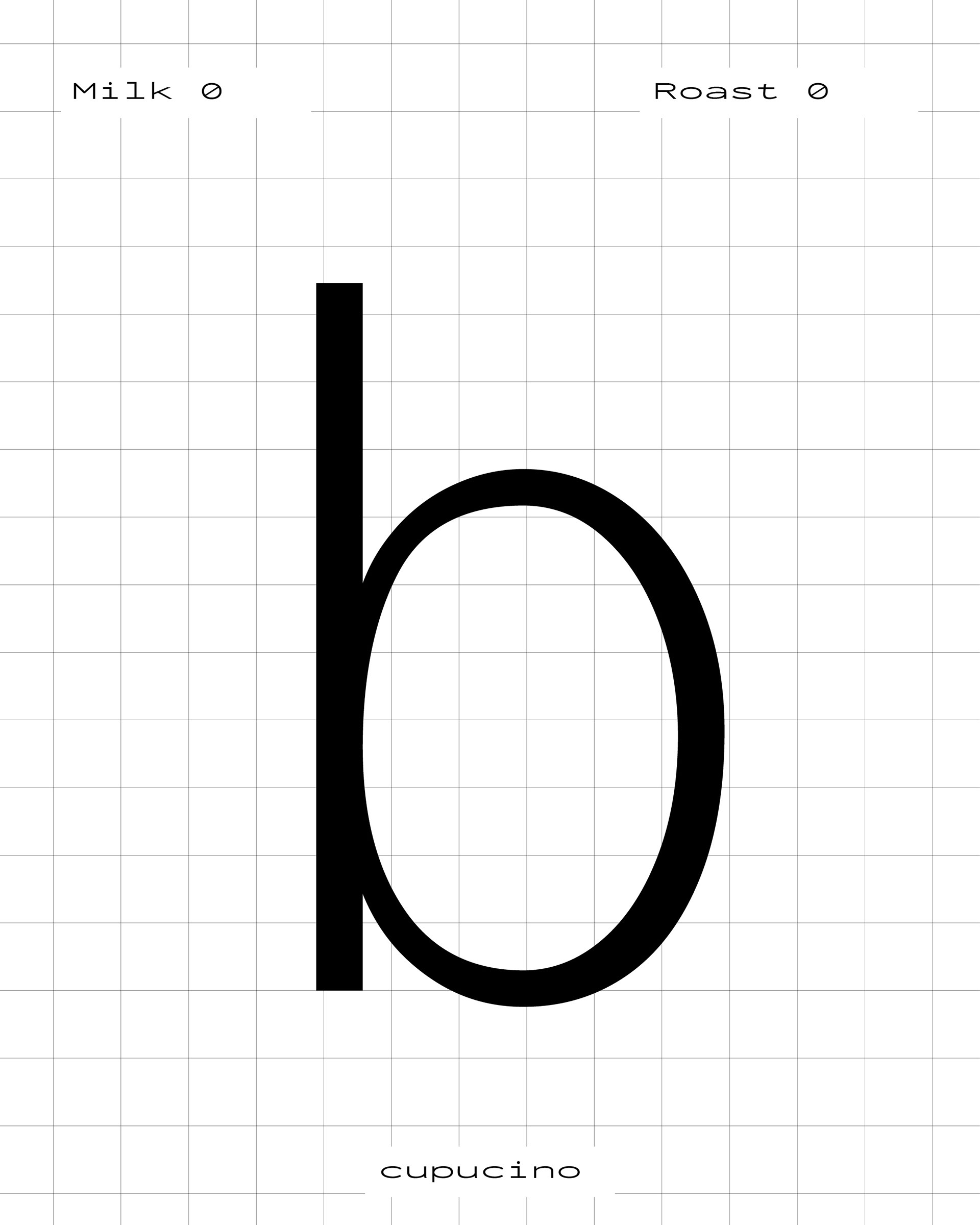
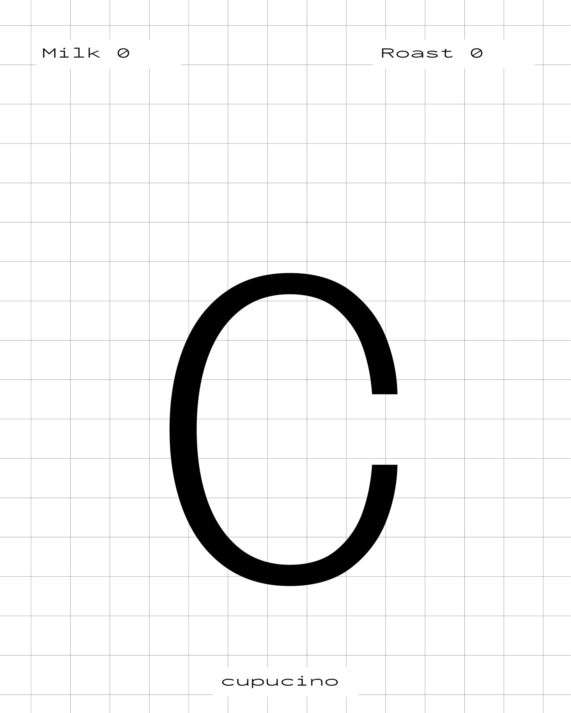
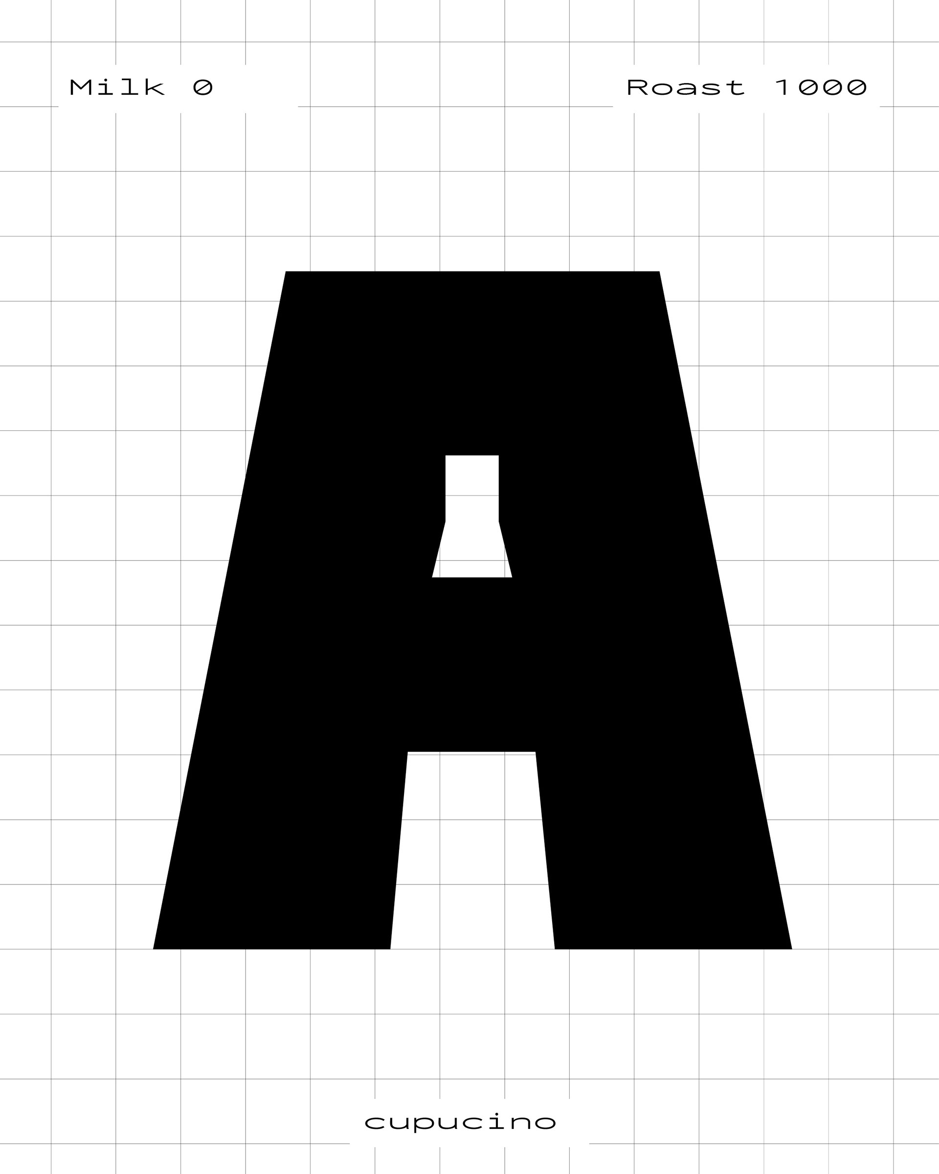
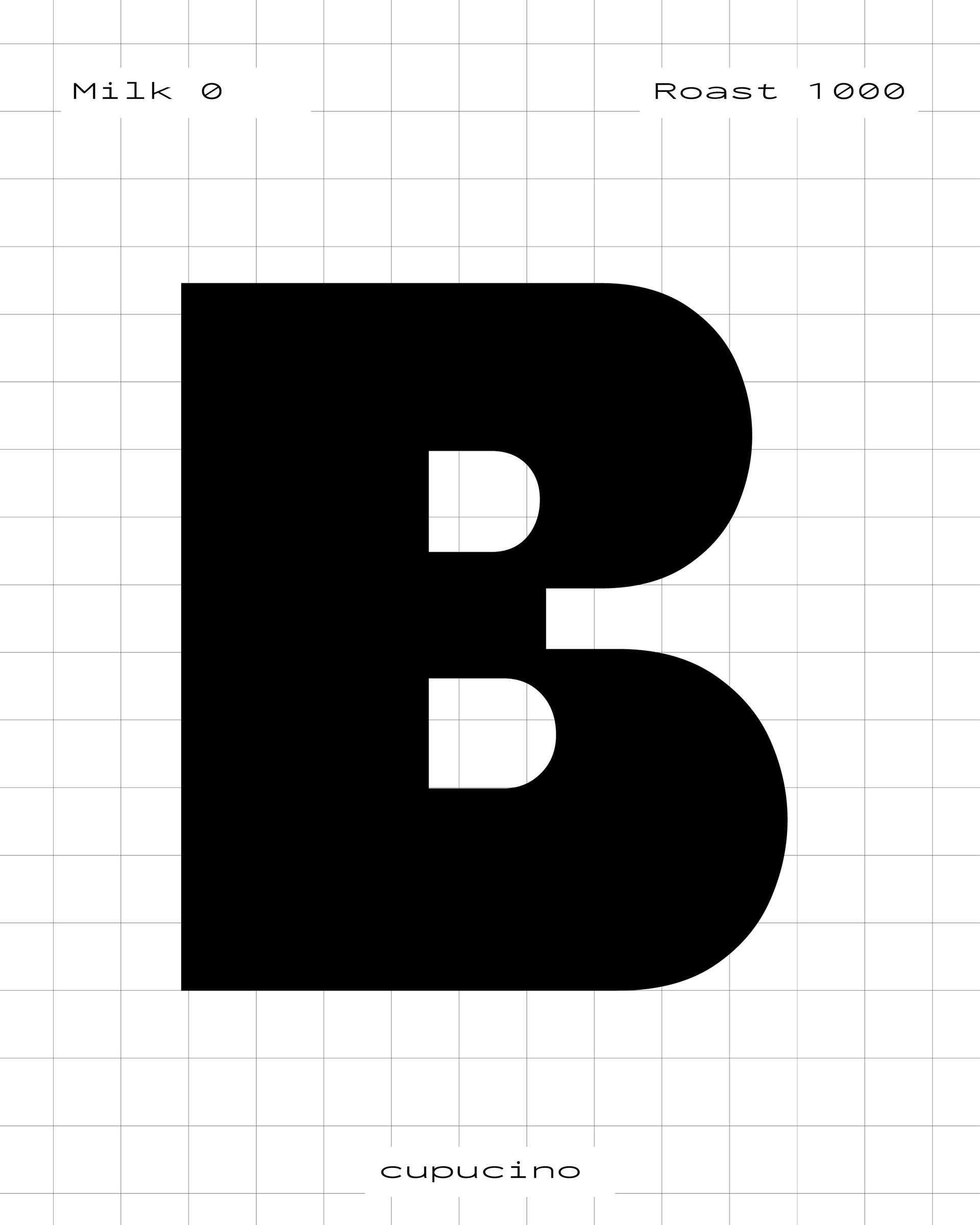
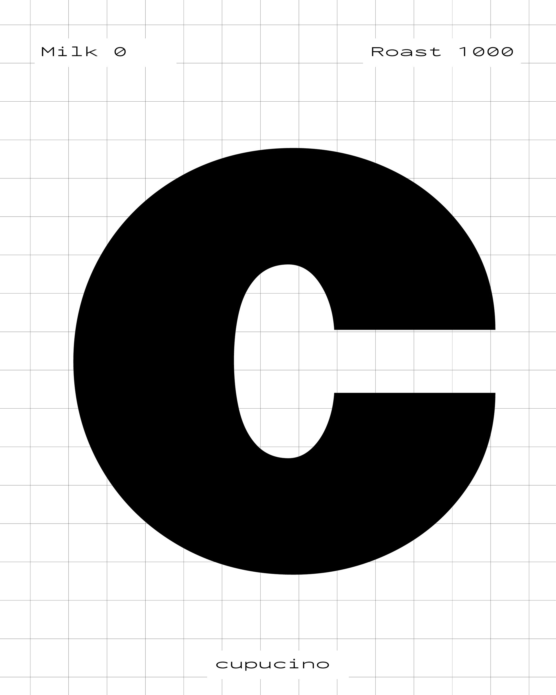
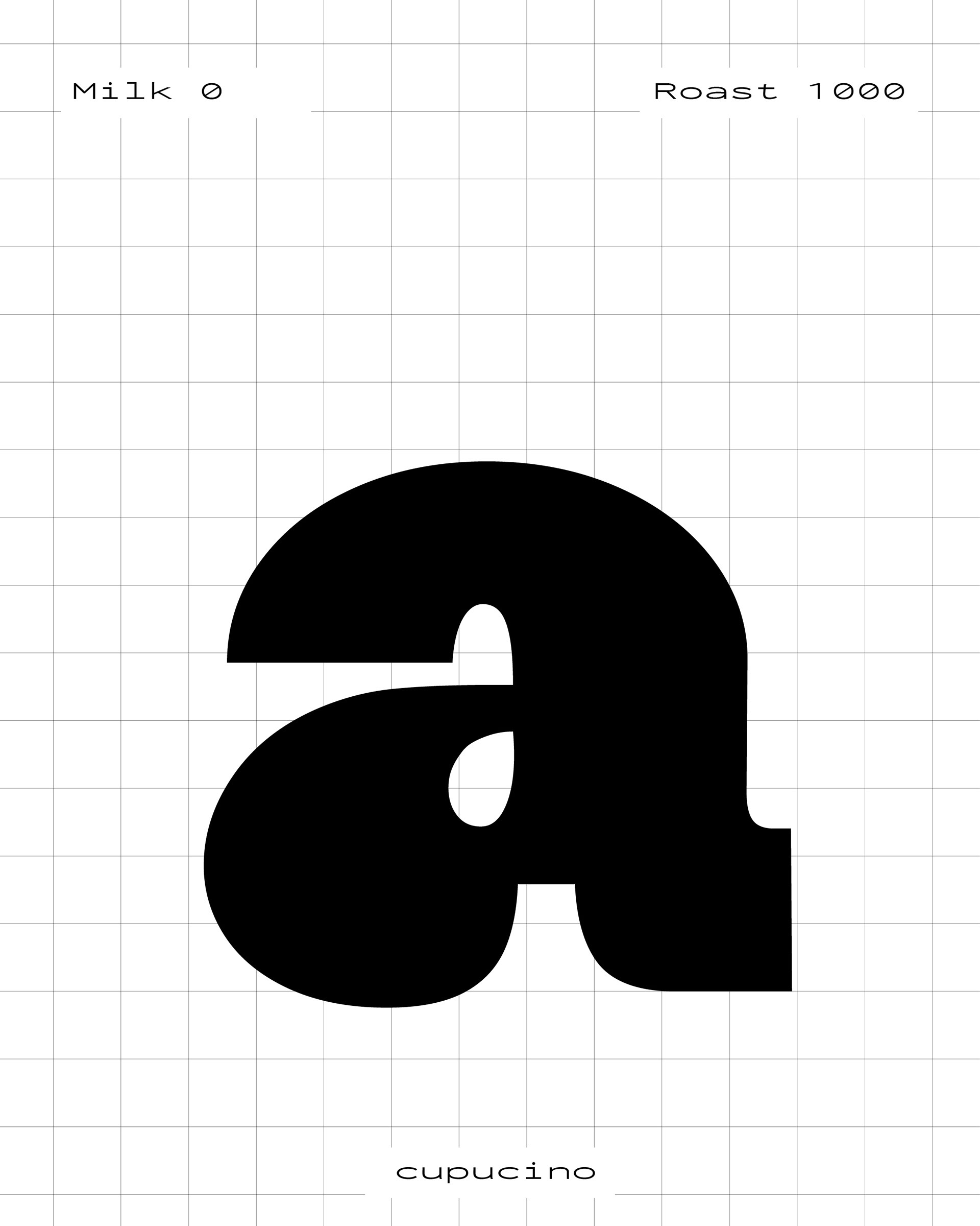
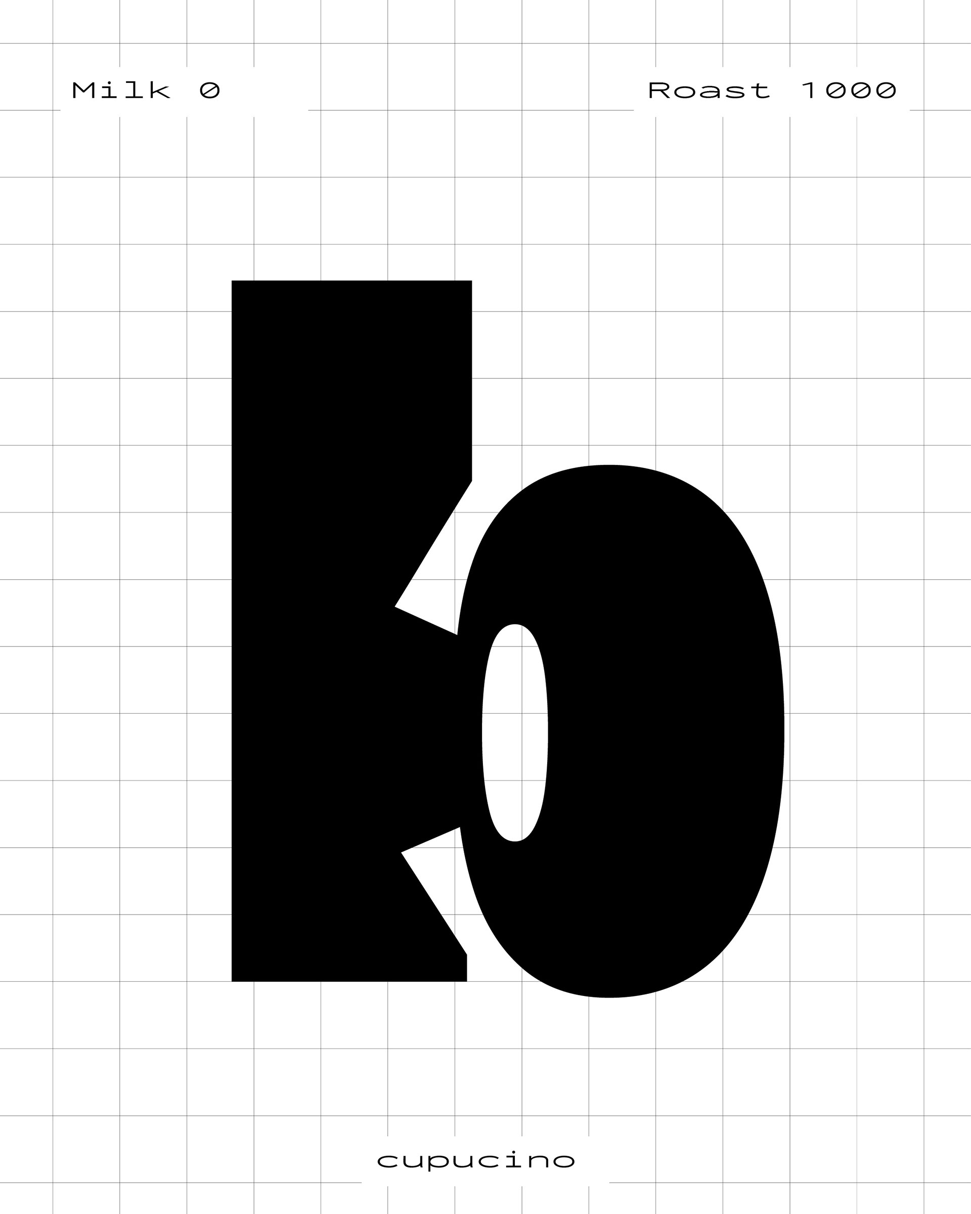
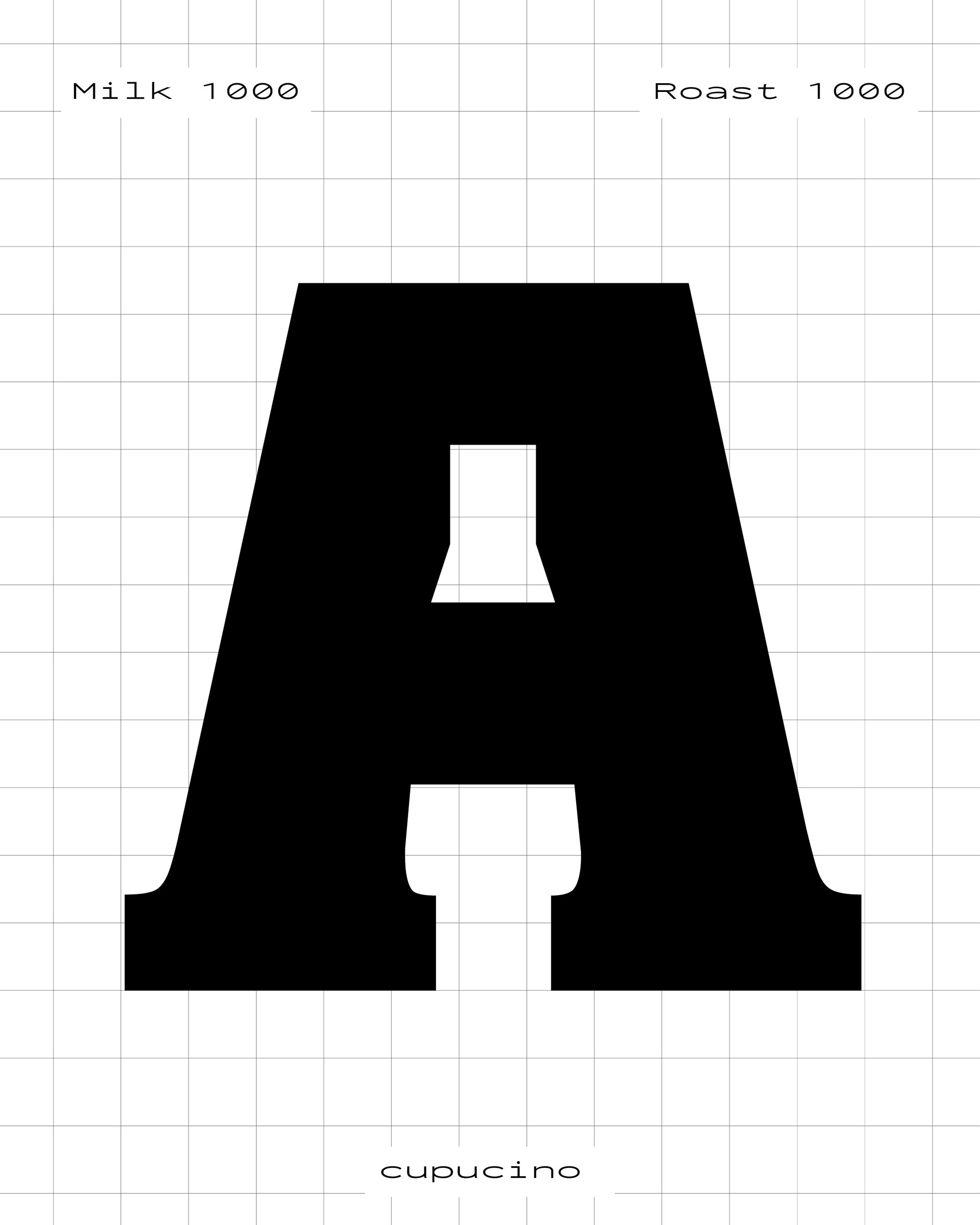
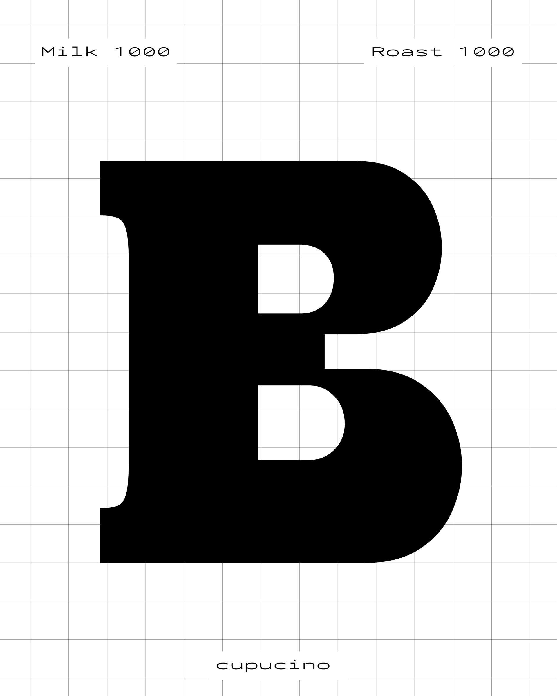
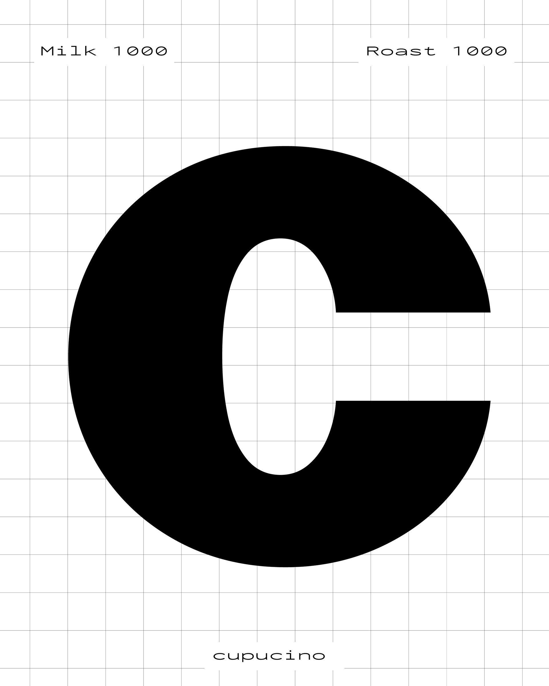
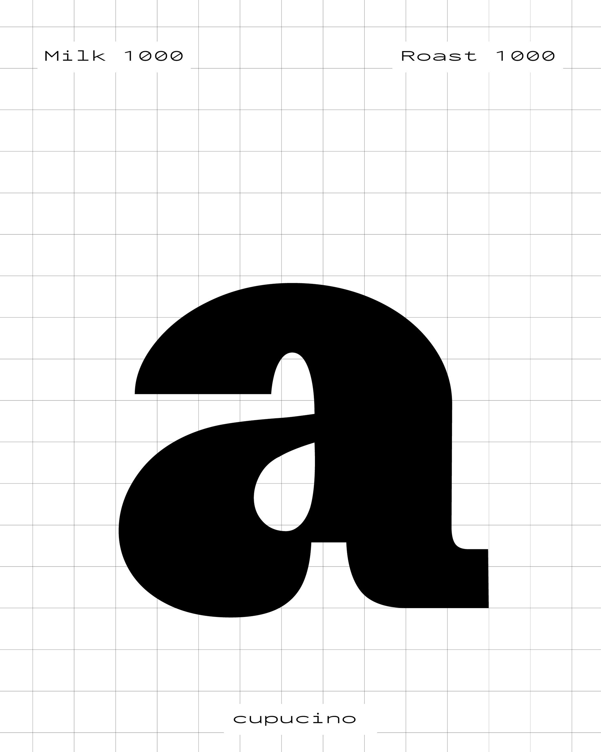
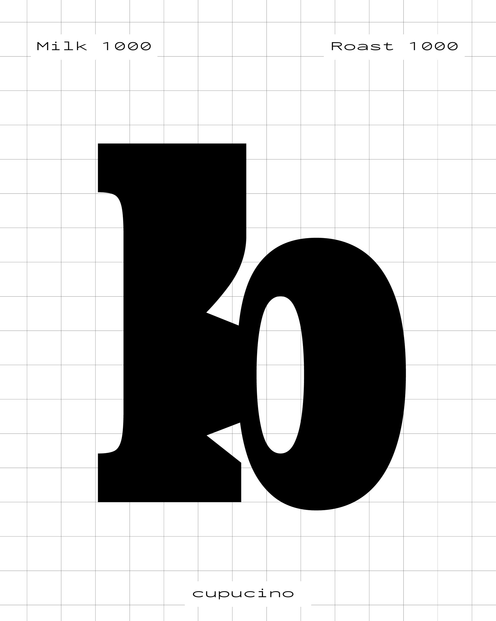
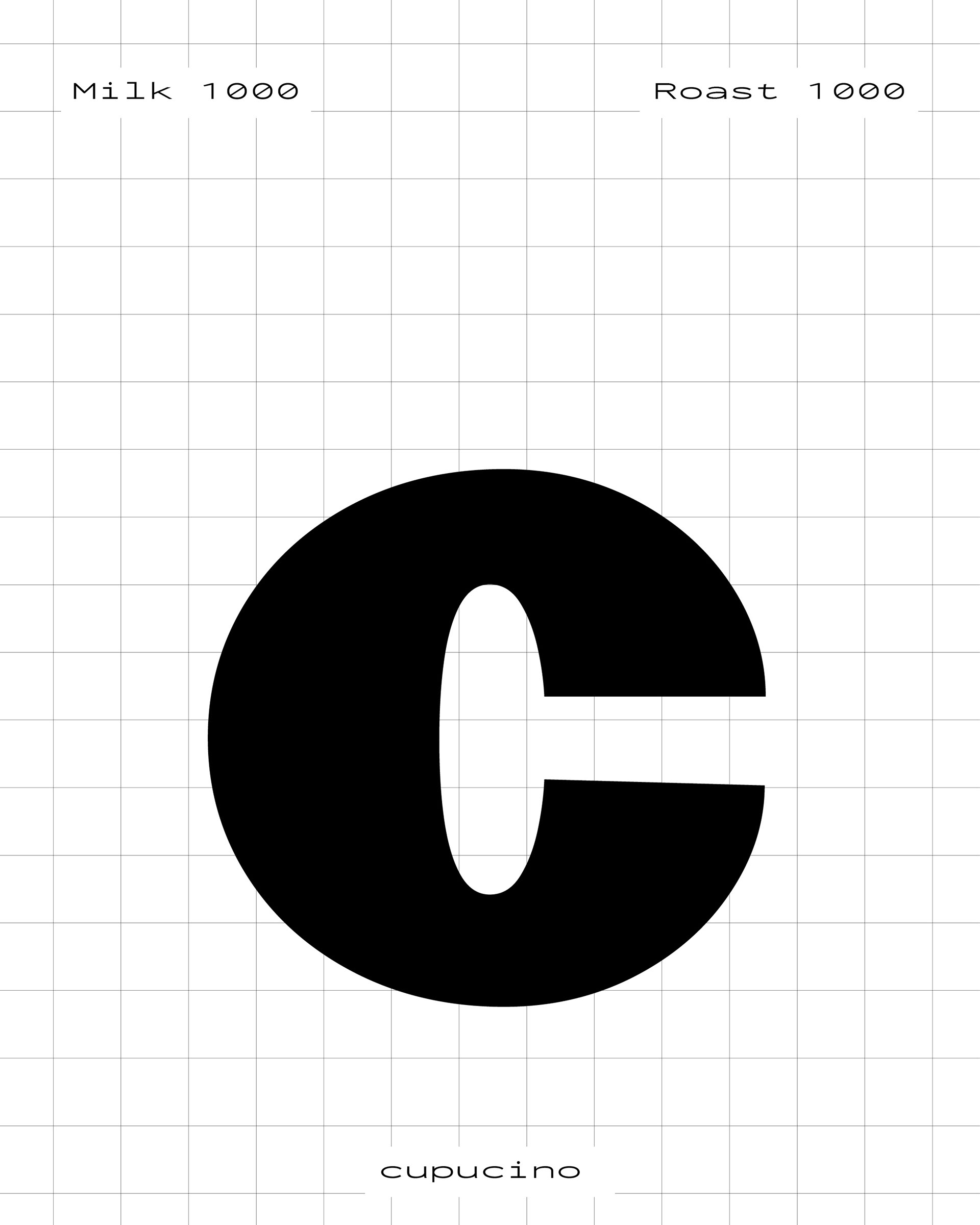
Cupucino is a variable font that visually captures the taste of specialty coffee.
It is a display typeface designed for use across all areas of the specialty coffee world.
It is a display typeface designed for use across all areas of the specialty coffee world.
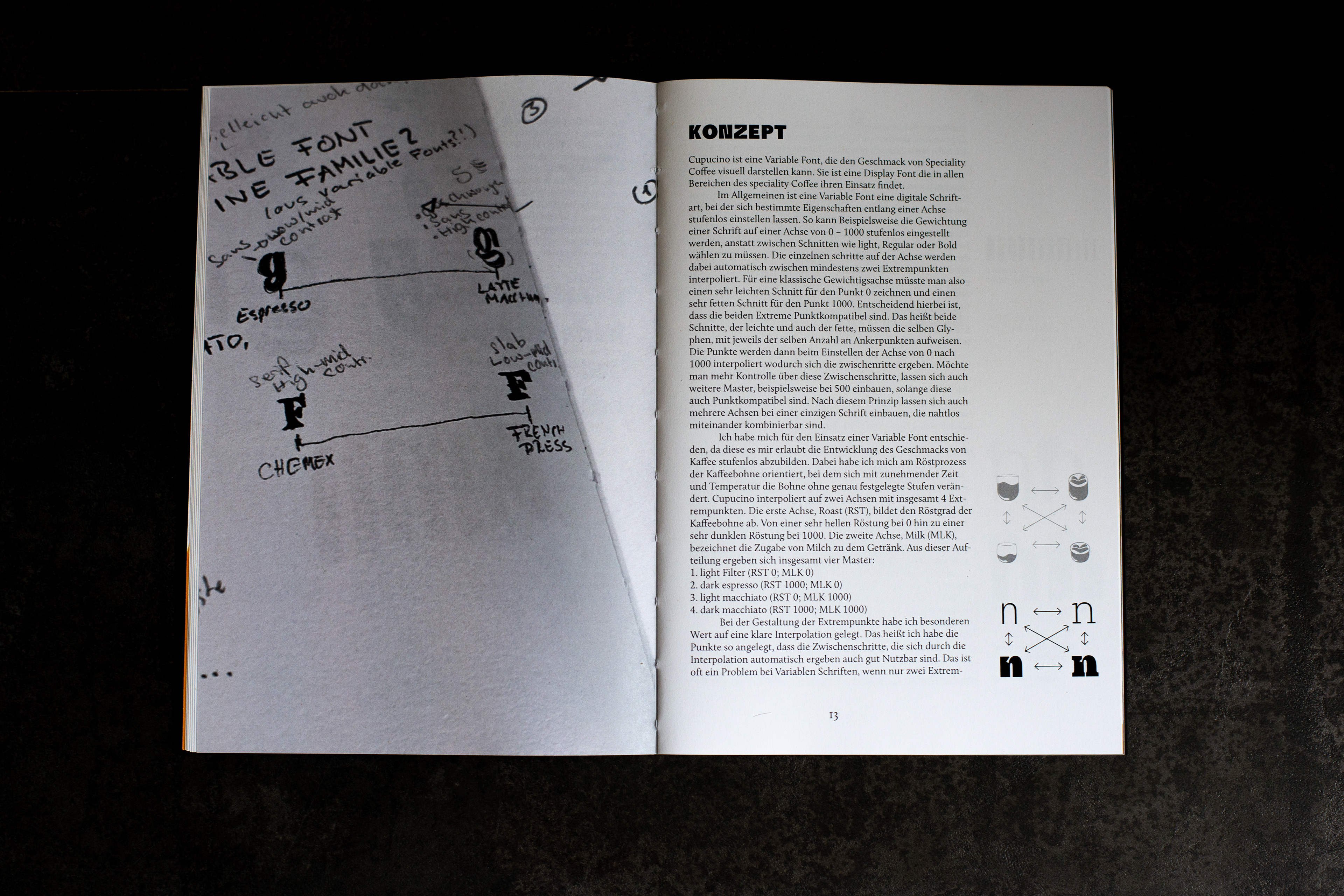
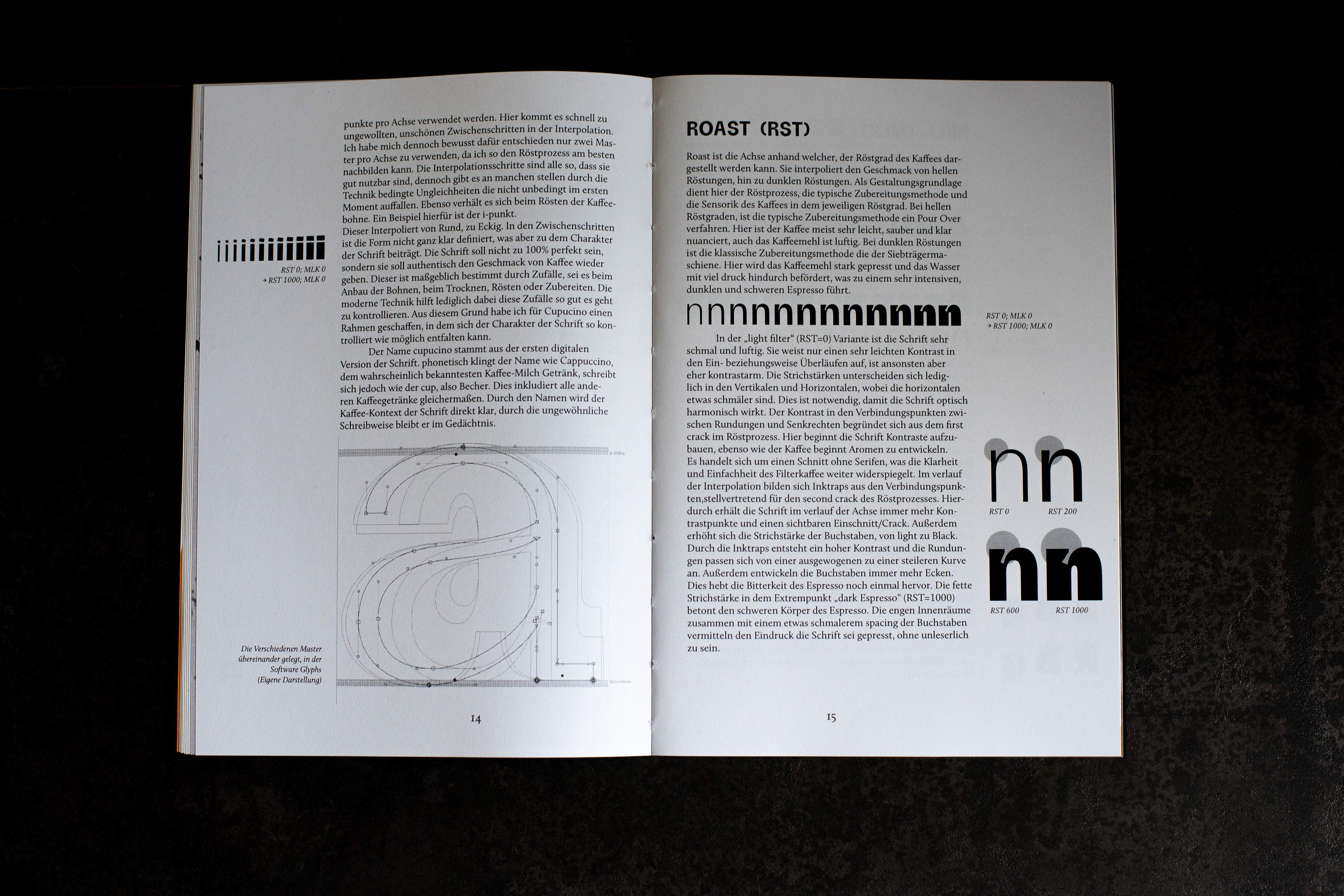
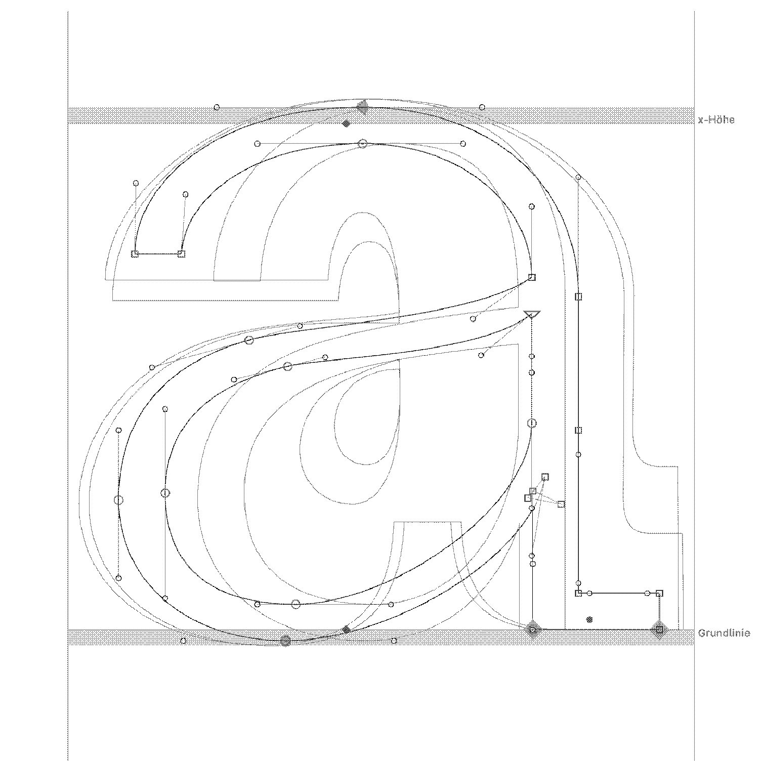
A variable font makes it possible to seamlessly represent the development of coffee’s flavor. I drew inspiration from the roasting process of the coffee bean, where the bean transforms continuously with increasing time and temperature, rather than in fixed steps.
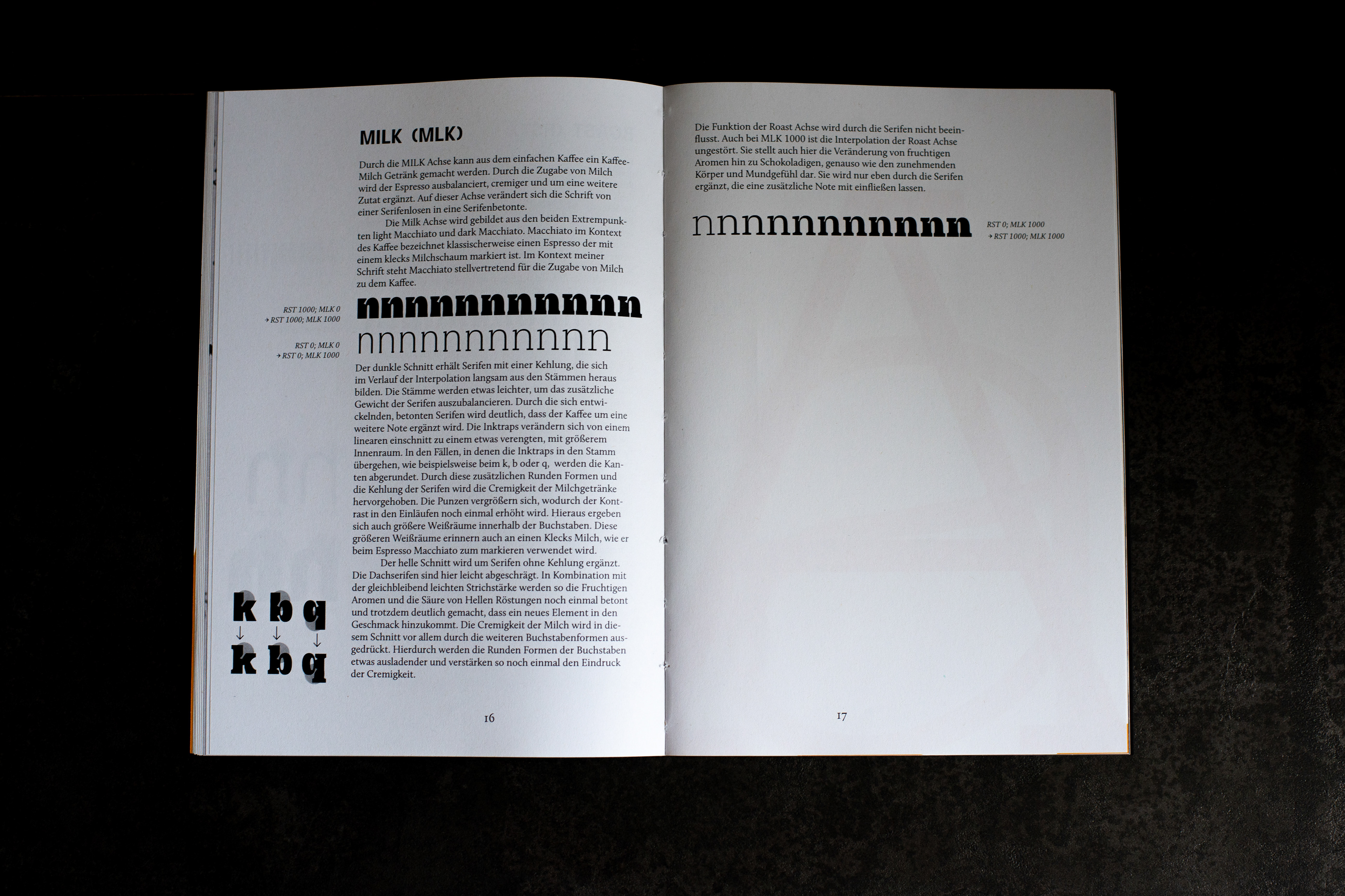
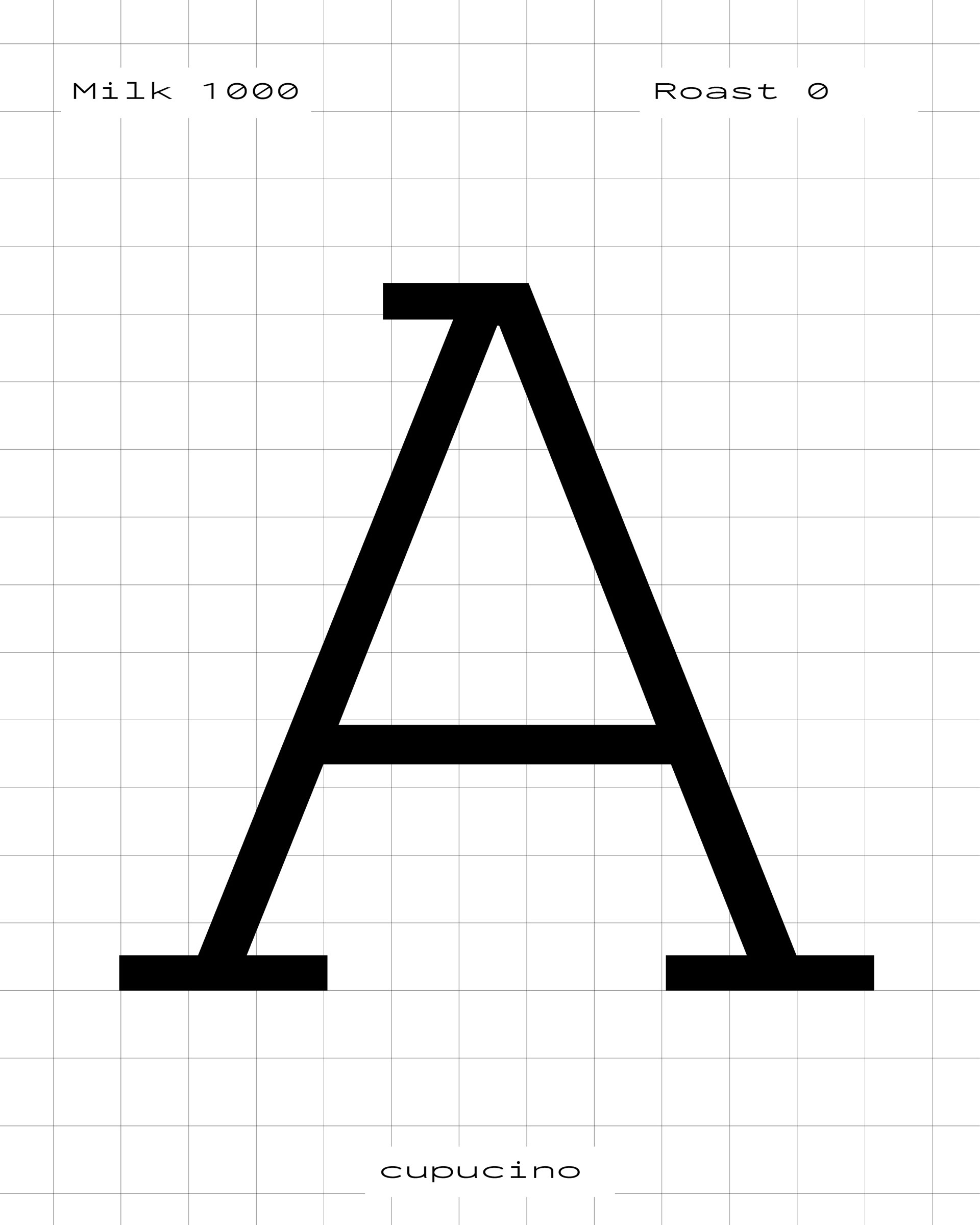
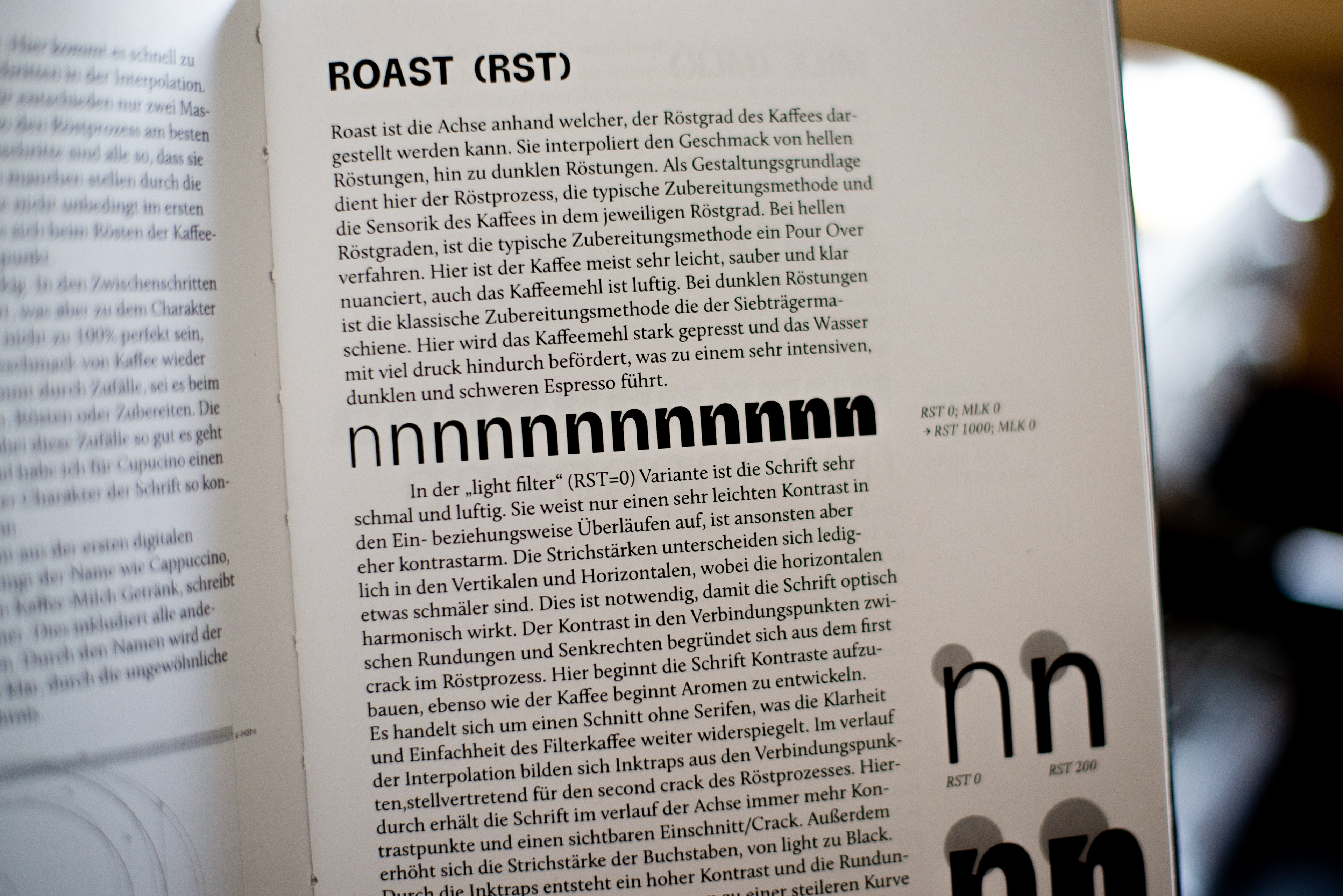
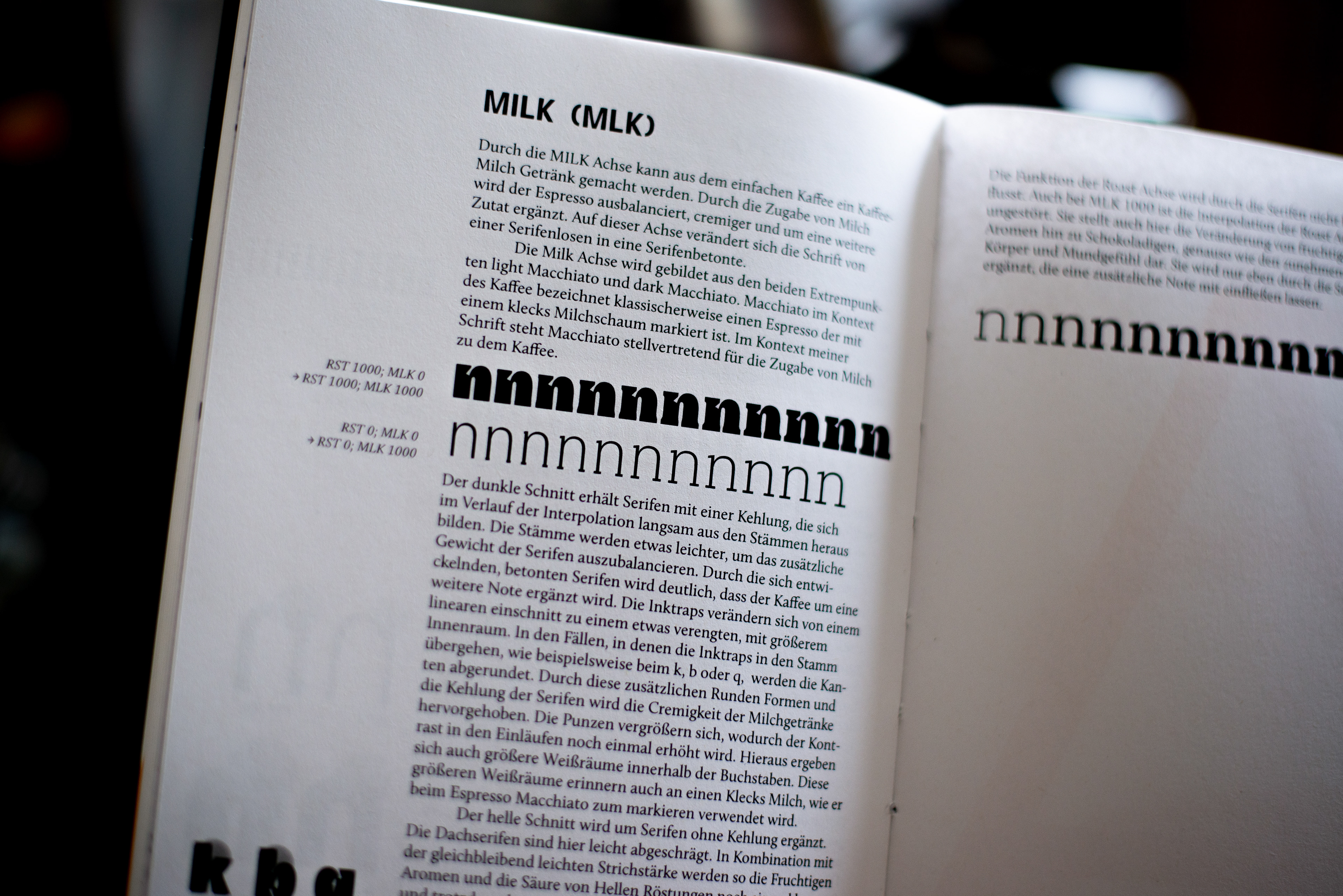
Cupucino interpolates along two axes with a total of four extremes. The first axis, ROAST, represents the degree of roasting, ranging from a very light roast at 0 to a very dark roast at 1000. The second axis, MILK, refers to the amount of milk added to the drink.